Showing posts with label bespoke. Show all posts

Sunday, 29 August 2010

FESTIVAL SEATING PLAN


I was recently commissioned to design a special seating plan and table name cards for a couple who married this August. They tentatively contacted me about 6 weeks previously following recommendations of my work from happy brides on a wedding forum. Their brief was rough and fairly open to combine their love of music festivals, gigs they've shared together and to include photos and lyric quotes if possible. 

I went away with a few immediate ideas based on a special festival style poster seating plan which were tested for viability.  There were so many elements to try to combine I was starting to worry the result may become too busy and actually detract from the function of the seating plan. So I then had the idea to combine their facing silhouettes with the heading to create a unique logo. I chose a decorative, slightly grungy font for the band names for design consistency and to avoid using actual band logos for copyright reasons. The couple kindly supplied me with personal photos and I set to work drawing it up. The result was fine but still not quite what I'd envisaged. Then amongst the personal photos they emailed I found a lovely candid shot of them together taken at one of the gigs - it was natural, happy and encapsulated the whole spirit of their original request. It worked perfectly.

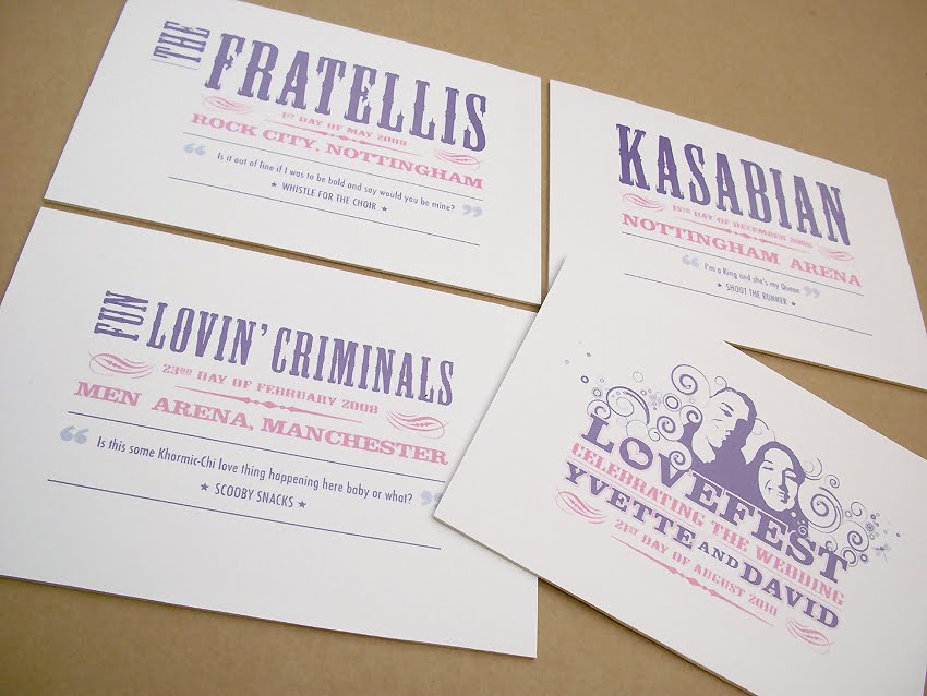
The table cards became mini versions with the 'logo' on the reverse and an appropriate song quotation of the couple's choice along with the band table name and the date & venue they saw them perform.

My first set of design proposals shown to Yvette & David was met with "We can't find the words to say how much we LOVE this! Thank you so, so much - it has surpassed our wildest expectations - we actually got quite emotional looking at your designs, they are perfect and we are so happy!"

Final artwork was approved and colours requested to fit with their other venue styling. The poster was printed on A1 satin paper and mounted in a slim silver edged frame and the photos above emailed to clients prior to sending the parcel. Their response...?

"Aaagggghhhhhhhhhhhhhhh the photos are AMAZING!! Thank you so, so much! I have been going through a bit of an 'in shock' phase this week so far that the wedding is almost upon us. This has just completely broke me out of that and I could scream with excitement! When we first thought of it we didn't know if anyone would 'get it' but you have totally brought it to life. I can't wait for our friends to see it - we have kept the idea top secret, and I think our friends and fellow gig buddies will really love it!"

Monday, 21 June 2010

CHERRY BLOSSOM


Client Brief
Handmade style stationery in pink and brown with a hint of cherry blossom.

Items
Day and Evening Invitations.

Several styles were presented to the client including a flat layered and label format and. The chosen design was worked up based on the elements she liked from the proposals to create a delicately pretty label style card.


LILIES & THISTLES

Client Brief
To combine Calla Lilies with a Scottish Thistle in an understated classic style

Items
Day and evening invitations and matching guest book.

It was felt this would work well as a label design layered with pale green and ivory board and a finishing hint of sparkle.


AFTERNOON TEA PARTY WEDDING


Client Brief
A Vintage style tea party themed wedding incorporating the colours and roses of the bride's bouquet and pearls.

Items
Day and Evening Invitations with separate reply cards - reception stationery to follow.

The chosen concept was a booklet invitation decorated with a chintz style monogram suggesting a vintage teapot shape and finished with soft ivory ribbon and pearls. The invitation part was layered on a delicate rose damask card stock.


PERFECT EQUATION


Client Brief
To develop a Save the Date magnet from our previous website gallery but within a minimal, classic style

Items
Letterpress printed day and evening invitations, post box and Order of service booklets within a set budget

The "equation" idea was developed with dictionary definitions and old style text book typography to create a motif. The concept really lent itself to a letterpress print method that gave an added tactility. Each item had a variation of definitions and equation to suit it's use.


TREE HOUSE VENUE


Client Brief
Wedding Day stationery reflecting a contemporary, intimate ceremony in a stunning Tree House setting incorporating foliage and a carved heart on treebark motif.

Items
A full wedding programme, combined menu, favour and personalised place tags, cupcake menu signage.

The client had fallen in love with our "Alice in Wonderland" work created for another client but wanted a design appropriate to her wedding. Taking the spirit of the Alice wedding programme, but adding vibrant foliage and flowers with delicious typography and inspired page layouts created a perfect keepsake for the guests. The design was carried through onto place name tags with each guest's food choices and a thank you poem.


SCOTTISH LOCH WEDDING


Client Brief
To incorporate 2 otters with Royal Stewart tartan and natural loch pebble colours.

Items:
Save the date cards, invitations, place/favour tags and Order of Service

We presented 3 main concepts including a monogram with fluid outlined otters entwined with the initials and a whisky label inspired typographical style. The chosen design was worked up using a beautiful ivory card stock with a speckled natural paper in shades of browny/greens in contrast to the bright Stewart tartan ribbon.